
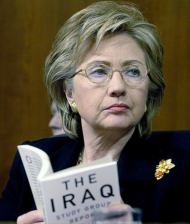
The photo of Hillary Clinton in Time isn't just "unflattering," it's a classic case of artful manipulation.
...Note that the primary focus is a bit "deep" with the clearest areas around the ears and neck. The nose is slightly out of focus as is the band of hair directly in front of her forehead. But it still seems "sharp" all over with an especial emphasis on the skin. That comes from "sharpening" in Photoshop that increases the "edge contrast" to exaggerate the apparent detail in the photo. Normally sharpening for a portrait, which has large areas that are similar in tone and gradual transitions, is different from what Photoshop expert Joe Reifer would call a "high frequency area" (many abrupt transitions in tone) like a cityscape. By emphasizing the inappropriate sharpening one can call unwelcome attention to skin, that would not perceptible be to the naked eye. The effect, of course, is to make her haggard and drawn looking.
Secondly, the gold jewelry and glasses are all the same heightened tone which is achieved by the "saturation" tool that ramps up the apparent color. In this case it also brings the brooch into play in the image. But it does even more to make an unflattering image by emphasizing the "gold" glasses and jewelry of a stereotypical "older" lady. Hollywood uses the technique all the time to "age" an actress. Interestingly, they used the "blur" tool to take out the folds under her eyes. Also, they didn't make the lipstick more garish with "saturation" as happened in the case of Katherine Harris, though Hillary's hair has been softly streaked with the same gold as in the brooch.
But the most interesting problem is how the editors managed to sharpen the book in the foreground. It is held at a typical reading range of between 18 and 24 inches. With the telephoto lens that made the picture, it should be largely out of focus. Note that her fingers that grasp the book are completely out of focus developing typical "rings" in the highlight areas. Yet the type on the book is very clear. Ah yes. The type was rebuilt in Photoshop as well.
So we now have a dour, tired, pained, haggard Hillary with dead eyes staring towards who knows what.
The most interesting question, of course, is "why". Why would Time skewer Hildebeeste like this? Powerline suggests that Hildebeeste is out and Obama is in...


3 comments:
That kind of ugly doesn't need help.
Obama's electable because he doesn't have any baggage, and I'm not talking about the ones under the eyes. All he needs to do is stay out of trouble, and continue to spout the platitudes that Dems love, and he's a lock for the nomination.
Hillary's baggage makes her look like a Democrat version of Nixon.
His comment about the fingers is wrong. The image is clearly shot through a water glass on the counter in front of her. If this is the level of attention he pays to the image analysis why trust his other opinions.
Post a Comment