
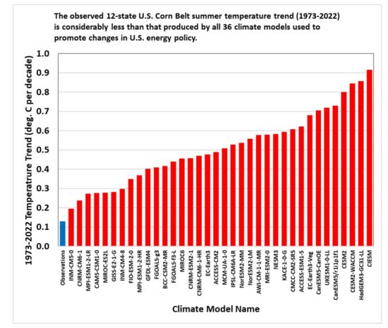
In the following graph, the BLUE bar (far left) is the observed (actual) temperature gain over the last 50 years in the Corn Belt of America.
The RED bars are "models" and "projections" of temp-gain in the same time period and location.
As a reminder, you're giving up reliable and cheap electricity, gas stoves, and internal-combustion engines because of the lies bad guesses pushed by the red-bar people.


No comments:
Post a Comment